by Ron Reeder and Christina Z. Anderson
Excerpt from Gum Printing and Other Amazing Contact Printing Processes
© Christina Z. Anderson 2013, all rights reserved.
Following is a relatively simple three step method for making digital negatives. With some of the more
forgiving processes like gum and casein, only the first two steps may be necessary. The system is based on
the Epson printer that uses Ultrachrome ink sets and comes with the Advanced Black & White System
installed in the driver. The best transparency film substrates are made by Arista, Ink Press, or Pictorico;
have some on hand. Capture the image in camera either RAW or TIFF at the largest file size possible. Also,
keep or convert the image to 16 bit depth and Adobe RGB (1998) or its grayscale equivalent, gamma 2.2.
Three-step negative workflow
-
Determine the Basic Exposure Time for the photo process to be used to give maximum black.
-
Determine overall negative contrast to match the contrast of the process and give “paper
white.”
-
Make midtone adjustments to match the response curve of the process.
Download Step Wedge Photoshop file
Step 1: Determining basic exposure time
The aim is to determine the minimum UV exposure needed to obtain maximum black when printing through the
transparency material on which the negative is printed.
-
Coat a half-sheet of paper with the light sensitive emulsion of choice.
-
Place a sheet of transparency material on top to cover half of the paper.
-
Place a sheet of opaque material so it covers both halves and leaves a strip exposed at the top.
-
Make an exposure (maybe one minute).
-
Move the opaque material down to uncover another strip and make another exposure.
-
Continue this process until there is a series of increasing exposures extending across the junction
between
transparency material and no material.
-
Develop the test sheet and dry it. Notice that on strips that received short exposures the boundary
between
transparency material and none can easily be seen. The goal is to find the exposure where this boundary
becomes
invisible. This is the minimum exposure that is capable of giving maximum black through the transparency
material (or some other hue, e.g. maximum blue with cyanotype). Once the Basic Exposure is determined
for that
process on that paper it does not change. If a final print turns out to be too light or dark, this is an
indication of another problem in the workflow.
Step 2: Negative contrast
The second step in making a digital negative is to adjust the overall contrast of the negative to match
the contrast
range of the emulsion. For example, a palladium emulsion requires a negative with rather high contrast
(more ink). A
gum emulsion requires a negative with fairly low contrast (less ink). The way this adjustment is done is
by
controlling the maximum amount of ink the printer lays down. There are two sliders that can be used to
adjust the
printer’s ink limit. The first is in the Advanced Black & White dialog of the driver. It is
called the Max
OD slider (Figure D). Its default setting is 0 and we will leave it at that setting.
The second slider is called the Color Density slider (Figure D2) and it is found by
clicking on
Printer Settings (see Figure C) and opening the Advanced Media Control dialog. The Default
setting
for the Color Density slider is 0 and this yields a relatively low contrast negative suitable for gum or
cyanotype.
Moving the slider towards +50% yields higher contrast negatives suitable for palladium or salt prints. Here
is the
workflow to determine the correct negative contrast to match the photo process.
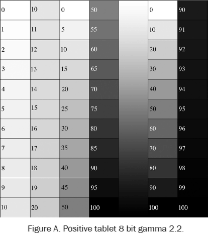
-
Download the free Step Tablet image file at alternativephotography.com. Open the file in Photoshop. An
image of
this step tablet is shown in Figure A.
-
Flip the tablet image horizontally (Image/Image Rotation/Flip Horizontal) and then invert to a negative
(Image/Adjustments/Invert). Flipping the image ensures that left and right handedness will remain
correct when
the ink side of the negative is placed against the emulsion side of the paper during print exposure.
-
The following instructions are specifically for a Mac computer running Photoshop CS6 with an Epson 4880
printer.
However they also apply to CS5 and essentially any Epson printer that uses the Advanced B&W system.
-
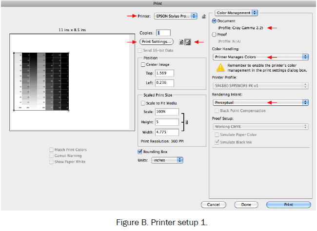
Go to File/Print. The dialog window that will open is shown in Figure B. In the
dialog
box:
-
Select the printer, Epson Stylus 4880.
-
On the right side, under Color Management, check the button beside Document. Presumably it
will say
Profile Gray Gamma 2.2 since that is the profile that should have been embedded in the image
file at
the very start of this workflow. If it says anything else, go to the bottom, hit Cancel,
bail out,
go back and convert the image to gamma 2.2, and start the print process all over again
(sob). If
gamma 2.2 shows, go down to Color Handling and select Printer Manages Colors.
-
For Rendering Intent choose Perceptual (the default).
-
Select either Landscape (horizontal) or Portrait (vertical) media orientation.
-
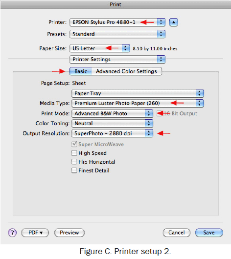
Click on Print Settings. Another window will open (Figure C).
-
Select the paper size (8½"x11").
-
Click on Layout and scroll down to Printer Settings.
-
Choose Paper Source (usually the paper tray).
-
Choose Media Type: Premium Luster Photo Paper. This choice tells the printer to print with
Photo
Black Ink (as opposed to Matte Black Ink). Photo Black ink is a weaker UV absorber than
Matte Black
but it is strong enough for most processes.
-
Under Print Mode select Advanced Black & White.
-
Color toning, leave it at neutral.
-
Output Resolution. Set at the maximum of 2880 dpi. This is important for obtaining the
highest
quality negatives.
-
Turn OFF High Speed.
-
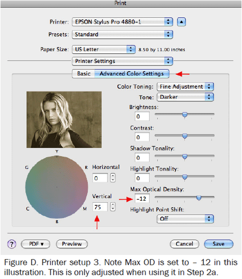
With all these settings entered, go back up to the middle of the window and click on Advanced Color
Settings. A
window will open with an image of a blond woman off to one side and a bunch of various sliders
(Figure
D). Only change one thing in this window:
-
Near the color circle is a box labeled Vertical. Type the number 75 into this box. This
action
causes the printer to throw the maximum amount of yellow ink into the image. Yellow is the
strongest
UV absorber after Photo Black. Increasing yellow makes the UV more dense and negatives more
contrasty. Hit SAVE.
-
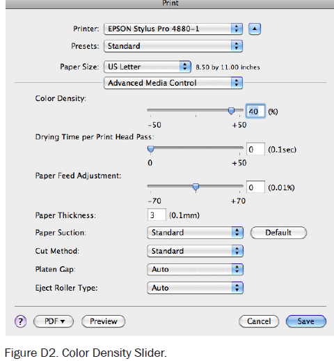
Now go back to Print Settings, click on Layout, and on the drop down menu select Advanced Media Control.
Move
the Color Density slider to set the contrast of the negative (Figure D2). The default
position
of 0 is about right for gum and cyanotype while higher settings, in the +30-40% range, are needed for
palladium
or salt. Hit SAVE.
-
Slide a sheet of transparency material into the paper tray, hit Print, and make a negative. Use a hair
dryer to
blow-dry the negative for a minute or two to get rid of all milkiness if the negative is to be used
right away.
-
Take the printed step tablet negative and use it to expose a sheet of paper coated with the photo
emulsion,
using the Basic Exposure Time determined in Step 1. When making the exposure, lay a small piece of
opaque
plastic so it slightly overlaps the 0% patches of the negative. Process and dry the step tablet print.
The dark,
100% patches of the print should be as black as the process can manage since that is controlled by the
Basic
Exposure. Now look at the area under the opaque plastic. This area has been coated by emulsion chemistry
but has
received no exposure. This reference area is the lightest tone obtainable with this particular emulsion.
If the
correct negative contrast setting has been chosen (Color Density slider, remember?) the lightest, 0%
patches of
the print will be very close in tone to the tone of the reference area. If the 0% patch is noticeably
grayer
than the reference area, it is necessary to go through the process again but this time move the Color
Density
slider to the right a bit to increase contrast. On the other hand, if several of the lightest steps look
as
white as the reference area, contrast is too high and it is necessary to move the slider to the left. To
streamline this process, make a series of step tablet negatives, one with the Color Density slider set
at 0,
another at +10%, 20%, 30%, and 40%. These varying contrasts will probably cover the entire range needed
for most
photo processes. When calibrating a new process, print a few and quickly determine which contrast
setting will
be necessary.
Step 2a: Advance media control
Another option for controlling negative contrast is to choose Enhanced Matte Paper as the Media option
(instead of
Luster Photo Paper). This choice will force the printer to use Matte Black ink which is a stronger UV
absorber than
Photo Black ink. When using Matte Black ink the Color Density slider is no longer needed. The entire
range of
contrasts needed for most photo processes can be obtained by changing the Max OD slider (in the Advanced
Black and
White dialog) from – 12 (low contrast) to 0 (very high contrast). Both Photo Black and Matte Black
ink will
produce good negatives. There is the option to use either one in case switching ink types is not
desired. If making
negatives for gum, casein, or cyanotype, use Photo Black ink and leave both sliders at their default
positions.
Step 3: Midtone adjustments
To adjust image mid-tones a positive print of the step tablet shown in Figure A will be made, using a
digital
negative with its contrast adjusted for this particular photo process. This print is then measured to
find out how
far off the mid-tones may be, and with this information a correction curve is constructed to bring the
midtones back
into perfect linearity. Once constructed, this correction curve will be applied to the positive image
file.
-
Print a digital negative of the step tablet. Flip the image horizontally, invert to negative, and print
it on
transparency material using the described printer driver settings, including the Color Density slider
setting
that gives the correct overall negative contrast for the photo process.
-
Expose this tablet negative to the photo emulsion using the Basic Exposure Time previously established.
-
When making the exposure, be sure to place a small piece of opaque plastic to slightly overlap the
lightest
patches of the tablet (the 0% patches).
-
Process and dry the tablet print.
-
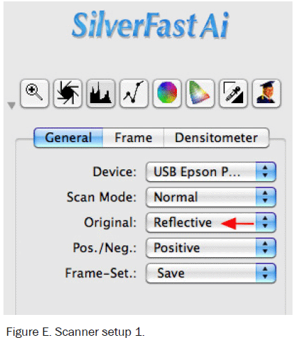
Scan the tablet print using a flatbed scanner set to Reflectance Mode. In the dialog box (Figure
E) click on the General tab and under Original choose Reflective.
-
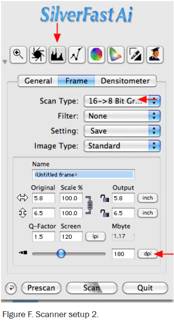
Next, click on the Frame tab (Figure F).
-
Scan Type. Choose 16/8bit grayscale (this is their way of saying that the scan will be in 8
bit
depth).
-
Set the resolution slider to 180dpi (low resolution is fine).
-
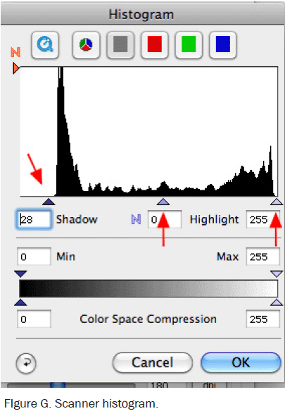
Hit the Prescan button. The scanner will make a very low resolution scan of the entire glass. Move the
guidelines to limit the final scan to just the step tablet.
-
Now go up and hit the histogram button at the top (third button from the left). This will open up a
histogram of
the step tablet prescan (Figure G). Move the shadow and highlight sliders so they are
just
outside of all the pixels (the dark stuff). Make sure the middle slider remains at 0. This will ensure
that the
scanner records all the information seen by the photo receptors and does not clip either the shadows or
the
highlights. Now go back to the main dialog box and hit Scan.
-
The scanned image of the tablet print should open in Photoshop. Do the following things to this image:
-
In Photoshop, go to the Windows menu, scroll down, and click on Info. The Info palette will open. In the
upper
right corner click on a small stack of lines that open the Panel Options window. For the First Color
Readout
select Grayscale. Close Panel Options but leave the Info Palette open. Now go to the Tool Bar, select
the
Eyedropper tool and in the tool options bar set the Eyedropper to measure an 11×11 pixel area
(this
further evens out the readings).
-
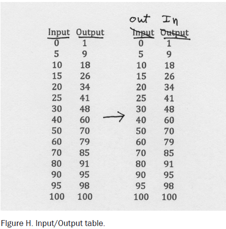
Take a sheet of paper and write two column headings on it, Input and Output. Values in the Input column
will be
taken from the numbers written on individual steps of the step tablet. Values in the Output column will
be
numbers read from the adjusted scan image of the step tablet print, measured with the Eyedropper tool.
If the
contrast selected via the Color Density slider for the step tablet negative is nearly correct the first
number
pair may read Input 0, Output 1. It is nearly impossible to get the Output from the 0% step to actually
read 0
without also raising contrast too high and clipping some of the high values. So I usually accept an
Output
reading of 1% as just fine. Hopefully the Output reading from the 5% step will be above 1% (5% would be
perfect). I find it useful to make readings in 5% intervals up to 30%, every 10% from then on, and
finally at
90%, 95%, and 100%. When done there will be two columns of paired numbers that will look something like
Figure
H. These number pairs describe a curve that shows how the image goes from pure white to pure black. On
the
original step tablet file Input equaled Output which means the midtones are linear. On the scanned step
tablet
print Input will almost never be the same as Output since most photo emulsions respond to UV light in a
nonlinear, S-shaped fashion. The number pairs in the Input/Output table just created will correct this
situation
and completely linearize print midtones for this particular photo process.
-
It is easy to make a correction curve from the number pairs in the Input/Output table (that is what all
computer
guys say just before pushing you into the deep end of the pool). Go to the top of the table, cross out
Input and
relabel it Output (this operation is shown in Figure H). Likewise, cross out Output and relabel it
Input.
Voilà! These are the number pairs needed to construct the correction curve.
-
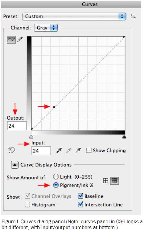
To use these number pairs, open any image file in Photoshop in order to access the Curves dialog box
(with an
image file open, go to Image/Adjustments/Curves).
-
Toward the bottom of the dialog box, click on the button beside Pigment/Ink%. Now, go up to the diagonal
line in
the Curves box and click anywhere on the line to place an active point (this is shown
in Figure
I). When this is done two more boxes will appear, labeled Input and Output.
-
Go to the Input/Output numbers (relabeled to describe a correction curve) and type in the first pair of
numbers.
The active point will move to the correct position.
-
Now add another active point, above the first point, and type in the next number pair. And so forth
until all
points for the entire correction curve have been added. Note: Photoshop only allows 16 points on the
curve, so
choose points where they really seem needed to define the curve (in the middle not so many points are
needed).
And Photoshop will not insert points that are less than 2% apart, so choose further spaced points.
Remember that
the real correction curve never dips down (it will always ascend) and will not have jagged dips and
rises. It is
quite acceptable to look at the finished curve and manually correct it to a smooth, reasonable curve.
-
Once the curve is constructed, click on the stacked lines in the upper right corner and choose Save
Preset. Name
the curve and choose a place to save it. A good suggestion is to make one folder to house all curves.
Final notes to this 3-step system
It is not necessary to go through all three steps every time. Step 1 is necessary to establish a Basic
Exposure
Time. It is almost always necessary to go through Step 2 and adjust the contrast of the image. Step 3
may not be
needed. For several processes that utilize a low contrast negative (ie, gum, casein, cyanotype) quite
acceptable
results can be obtained by just going through Steps 1 & 2 and skipping Step 3. Try it and see.
However, for
processes that need a higher contrast negative (examples are platinum/palladium, salt, and ziatype)
without a
midtone correction curve shadows will be much too dark and blocked up while highlights will be washed
out.
Monochrome digital negative
-
If the image is in color, convert it to black and white. The most flexible way to do this is to go
to
Image/Adjustments/Black&White. Play with the sliders until the desired look is achieved and
click OK.
-
Even though the image is now monochrome, it is still in RGB mode. Go to Image/Mode and select
Grayscale.
-
Be sure the image has gamma 2.2 embedded in it (the grayscale equivalent of Adobe RGB (1998)). Go to
Edit/Convert to Profile (NOT Assign Profile) and choose Grey gamma 2.2 as the destination space. If,
eventually,
Step 3 of this digital negative workflow is done, the digital step tablet has gamma 2.2 embedded in
it. It
is
important to be consistent and have the same profile embedded both in the image file and in the step
tablet
used
to calibrate the overall process. Flatten the image if it is not already (Layer/Flatten Image).
-
Apply a Correction Curve to the positive image that was derived from Step 3 of the Digital Negative
Workflow.
This will be done only if Step 3 has been found to be necessary. First open the Curves dialog box
(Image/Adjust/Curves). Click on the upper right stacked lines and choose Load Preset. A window will
open.
Find
where the correction curve is stored and click on it to open and hit OK in the Curves window. The
correction
curve will be applied to the positive image file and the Curves window will close (the image file
will also
start to look rather weird because the correction curve distorts it).
-
Go to Image/Image Size. Set resolution to 360 ppi and size the image to the final print size.
-
Invert to negative (Image/Adjustments/Invert) being sure to invert the image layer and not the curve
layer.
The
image should now only have two layers, the image itself and the curve layer.
-
Flip the image horizontally (Image/Image Rotation/Flip Horizontal) Flipping the image ensures that
left and
right handedness will remain correct when the ink side of the negative is placed against the
emulsion side
of
the paper during print exposure. Now the image is ready to print.
-
Print out a negative using all the printer settings previously described, including the correct
Color
Density
contrast setting.
Tricolor RGB negatives
-
Start with a color digital image that has been edited and is in Adobe RGB (1998) and 16 bit
depth.
-
Flatten the image to a single layer, then size it to 360ppi and the correct dimensions.
-
Invert the sized image to negative (Image/Adjustments/Invert).
-
Save at this step since the next step cannot be undone.
-
Go to Window/Channels. This will open the Channels panel. In the upper right corner, click on
the small
stack of
lines to open the Channel Options window. Scroll down and select Split Channels. This will cause
the
color image
to disappear and be replaced by three grayscale images, one for the Red, one for the Green, and
one for
the Blue
channel.
-
Rename the Red separation as imagename_BLUEneg.psd, the Green separation as
imagename_MAGENTAneg.psd,
and the
Blue separation as imagename_YELLOWneg.psd. Make a practice of also marking each negative as it
comes
out of the
printer as Blue, Magenta, or Yellow since they look nearly identical.
-
Be sure that each negative file has Gray gamma 2.2 embedded in it (Edit/Convert to
Profile/Select Gray
Gamma 2.2
as the Destination Space).
-
At this point there are two options. If the correct negative contrast has already been
determined the
negatives
can be printed in the gum layer of choice at the Basic Exposure Time determined in Step 1 of the
3-step
method
and the Printer Settings determined in Step 2, including the correct Color Density setting for
contrast.
-
On the other hand if more fine-tuning of the midtones is necessary, a midtone correction curve
as
described in
Step 3 will be necessary, but when applied to the RGB separations, it must be applied to the
positive.
Since at
this point the RGB splits are negative, it is necessary to invert each file back to positive,
apply the
correction curve, then re-invert to negative. Be sure to invert the image, not the curve. Print
the
corrected
negative using the Exposure and Printer Settings determined in Steps One and Two.
Troubleshooting:
Can’t see the print options shown in figure B?
No worries, newer mac operating systems have loaded an air print driver in your system, restricting
access
to certain options. To regain access, follow these steps: From System Preferences, select Printers and
Scanners. Delete your printer. Now click Add Printer or Scanner. Click the + sign in the lower left
corner.
A box will pop up with printer names. From the list, select your printer. Under NAME: the name of the
printer will appear. Under USE: you will see Secure Airprint. From that drop down, select your printer
name. Close the box. You are now set.